
CRO Strategist | Senior Product Designer
Evolving the commerce experience to strengthen conversion and support continued growth
•UX Audit & Conversion Strategy
•Product Discovery & Navigation
•Design System Refinement
•Responsive Experience & Accessibility
•Feature Development & A/B Testing
Tower 28 is a sensitive-skin-first beauty and skincare brand. I partnered with the team to refine and optimize the digital shopping experience, with a focus on elevating conversion and strengthening retention as demand grew. The work centered on identifying key friction points and streamlining how customers shop, evaluate products, and move through the site.
The goal was to evolve Tower 28’s digital shopping experience to support stronger conversion, a more premium and consistent customer journey, and continued growth as the brand expanded.
•Increase Conversion Across Core Shopping and Purchase Flows
•Strengthen Consistency, Responsiveness, and Usability Across the Commerce Experience
•Prioritize High-Impact Opportunities and Shape a Roadmap for Feature Development, Experimentation, and A/B Testing
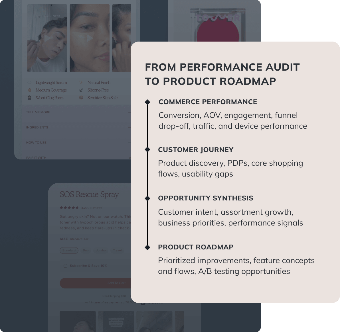
The engagement began with high-impact improvements across PDP and mobile, then expanded into a full e-commerce performance audit. I reviewed the shopping journey end to end, combining commerce data and heatmaps with a UX review of product discovery, navigation, PDPs, cart, checkout, and responsive behavior. The goal was to understand how the existing customer journey was affecting performance, identify key areas of friction, and uncover the strongest opportunities for improvement and growth.
I documented and prioritized the findings into a longer-term roadmap, balancing immediate improvements with larger product opportunities. Some became new feature concepts, while others were shaped into hypotheses for experimentation and A/B testing.
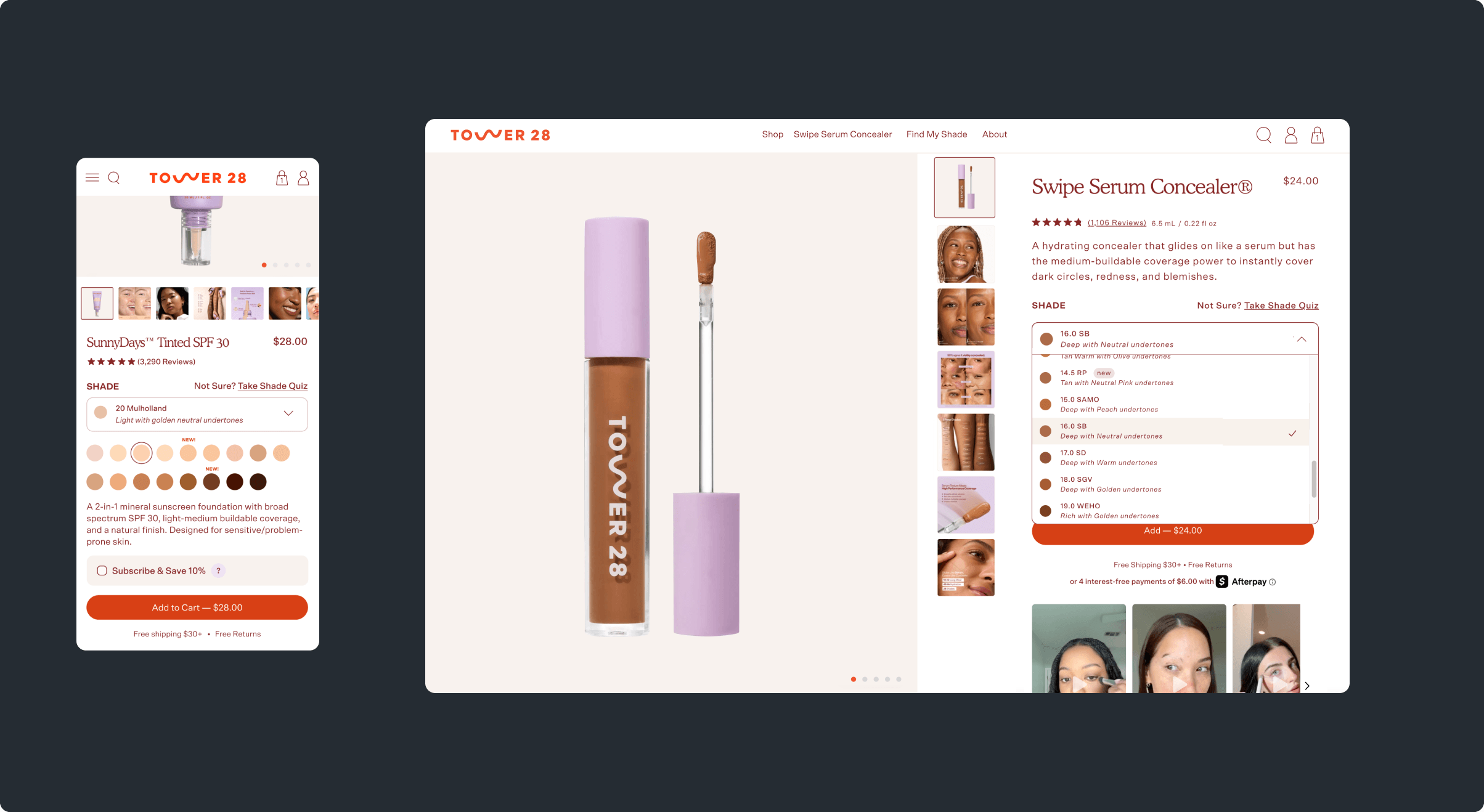
The focus was on refining content hierarchy and improving how users navigate product details. One critical area was shade selection — where users often struggled to differentiate between similar options. I addressed this by introducing more intuitive ways to browse and compare shades, allowing users to shop visually or use a structured dropdown with accessible shade information, making selection faster and more confident.
Conversion isn't limited to product pages. I applied an immersive, content-led approach to landing page experiences for Tower 28's hero product, using motion and visual storytelling to help users better understand the product. This experience creates a more compelling path from discovery to purchase, turning the page itself into a conversion touchpoint.
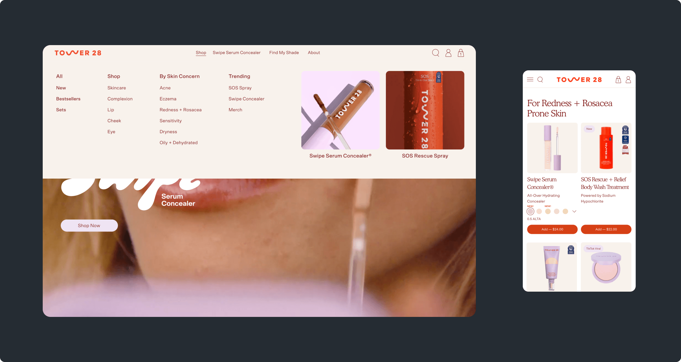
Navigation initially prioritized direct product access, primarily surfacing bestsellers while limiting visibility across the broader catalog. As the assortment expanded, this created a gap in product discovery and category exploration. To address this, I suggested to introduce a structured mega menu, enabling users to browse by category and shop by concern — guiding discovery through intent and making the catalog more accessible and relevant to different user needs.
As the experience evolved, inconsistencies across screens and UI components began to create friction in product exploration and purchase. Differences in color usage, typography, and component behavior made interaction cues less consistent across the site. I refined the system by aligning visual structure, clarifying color usage, and standardizing component behavior, creating a more cohesive and easier-to-navigate experience.
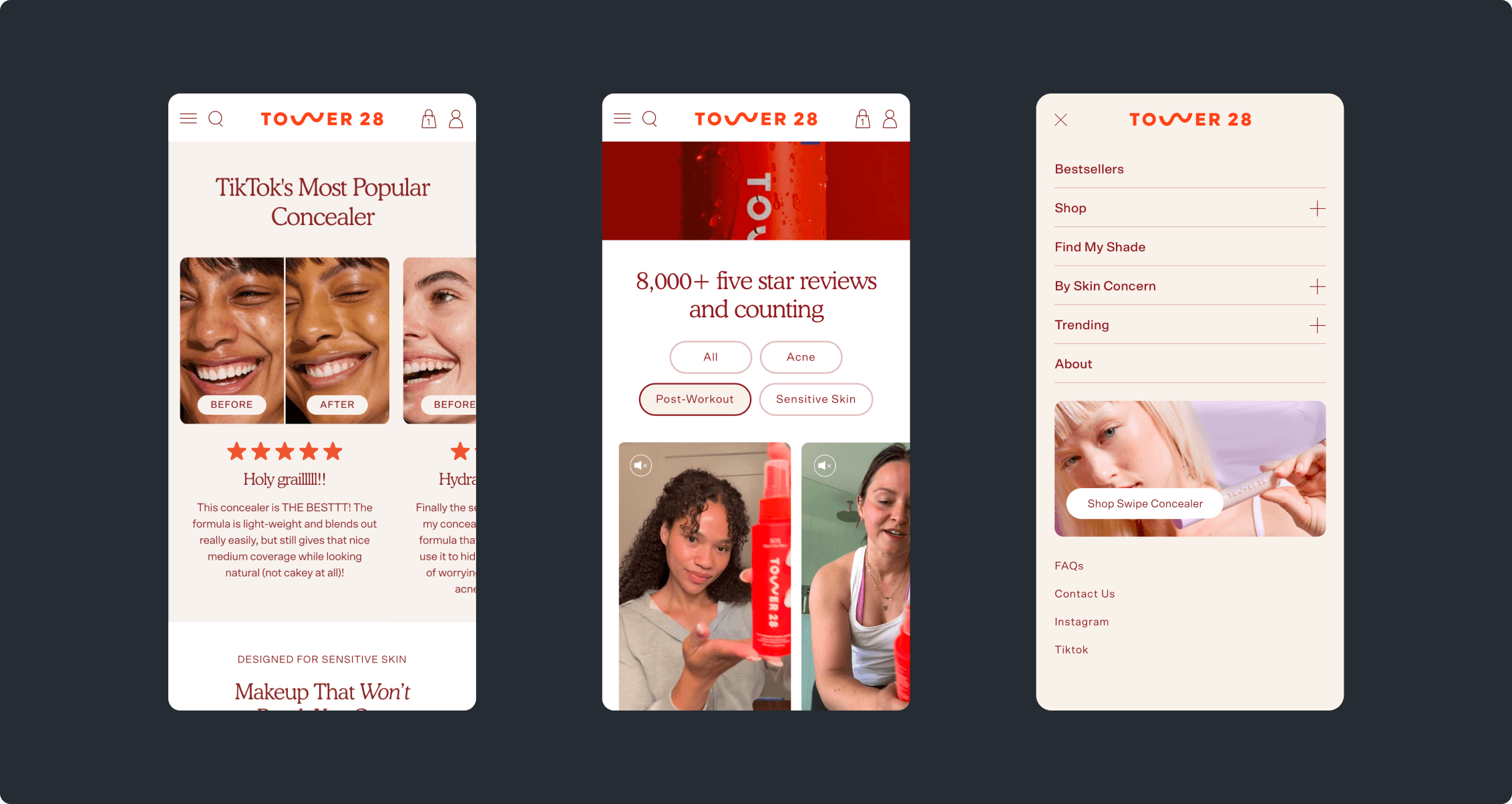
I worked closely with the Development team to improve responsiveness across the site. We refined the behavior of layouts and components across screen sizes, creating a more polished and premium feel throughout.